
Lifting conversion 38% with a rebuilt image stack and A+ content
+38% conversion rate
A wellness brand had traffic and didn't convert it. Nothing about the advertising was wrong — the listing simply never answered the two objections that stopped the purchase, so we rebuilt the images and A+ around them.

At a glance
- Category
- Wellness & Relaxation
- Marketplaces
- US, CA
- Revenue at start
- $121k / month
- Conversion rate at start
- 8.1% — category average 11%
- Engagement
- Creative & content + listing SEO
- Timeframe
- 5 months
Results
The challenge
Traffic was not the problem: the campaigns were well built and the listings ranked. Shoppers arrived and left. At 8.1% the conversion rate sat three points below the category, which on this traffic volume was roughly $40k a month walking away.
The review and returns data pointed at two specific objections, and neither was addressed anywhere on the page. Buyers could not tell how big the product actually was — a recurring theme in one-star reviews and in the return reasons — and they could not tell how long it ran between refills. The images showed the product beautifully lit and completely without scale, and the A+ content talked about the brand's story.
Our approach
We rebuilt the page around the two questions that were losing the sale.
- Scale in the first two frames — the product shown in a real room, in a hand, and against an everyday object, so size is unambiguous before the shopper scrolls.
- Runtime made explicit — the refill cycle stated as a number in the image stack and repeated in the A+ comparison module.
- A+ rewritten as answers, not narrative — the brand story moved to the bottom; the modules now cover sizing, runtime, cleaning and what's in the box.
- Copy aligned with the new creative — bullets rewritten to match the claims the images make, so the page doesn't argue with itself.
How we worked
- 1
Objection mining
Eighteen months of reviews, questions and return reasons coded into themes. Two themes — perceived size and runtime — accounted for most of the negative signal.
- 2
Image stack rebuild
Seven frames re-shot and rebuilt: hero, scale in room, scale in hand, runtime, what's in the box, care, and lifestyle last.
- 3
A+ restructure
Modules reordered to answer objections first; a comparison module added so the size and runtime differences between the two variants are readable at a glance.
- 4
Copy alignment
Title and bullets rewritten to carry the same two claims, keeping the ranking terms the listing had already earned.
- 5
Post-launch measurement
Conversion and return rate tracked per variant for eight weeks after the change, with the weaker of two hero frames swapped out on the evidence.
Inside the ad account
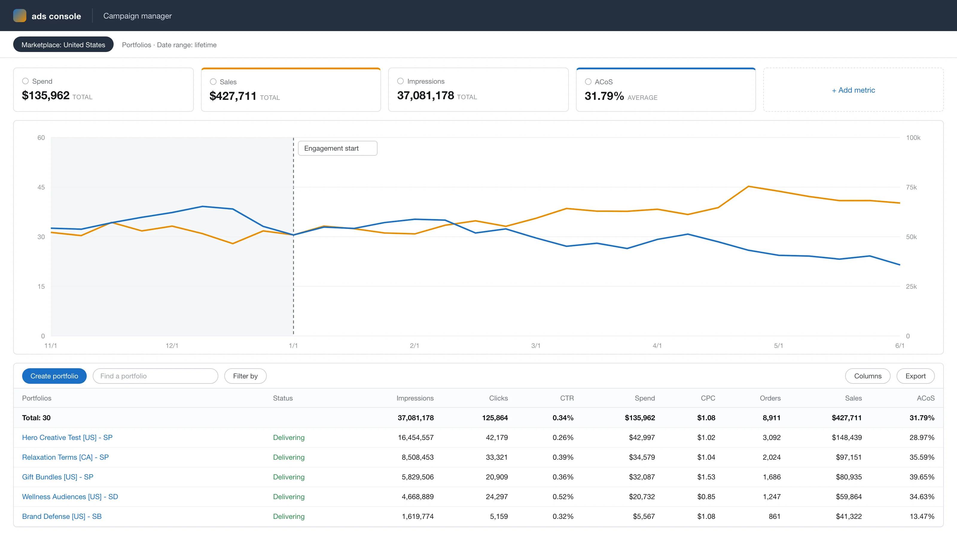
Anonymized account view, rebuilt from the figures reported above: ad sales growing from $54k to $76k a month while ACoS falls from 33% to 24% across the 5-month engagement.
The results
Conversion rate rose from 8.1% to 11.2% — +38% — and monthly revenue from $121k to $168k, on essentially the same traffic.
The return rate fell 3.3 points, which matters twice: fewer refunds, and fewer of the negative reviews that come with a product arriving smaller than expected. ACoS improved nine points as a consequence — the same clicks now produce more orders, which is the cheapest efficiency gain available to any account.
“Two years of optimizing the ads, five months of fixing the page. The page was the problem.”
Services we delivered
Related case studies



Ready to scale your Amazon brand?
Talk to a senior strategist and leave with a growth plan for your store — no obligation.